PRESS AND NEWS CENTER
20 Décembre 2019
Netflix’s The Two Popes Comes Alive With ‘the Language of Color’
Technicolor worked closely with cinematographer César Charlone to develop the color palette, addressing shifts in time and place, and giving everything the look of authenticity mixed with the divine.
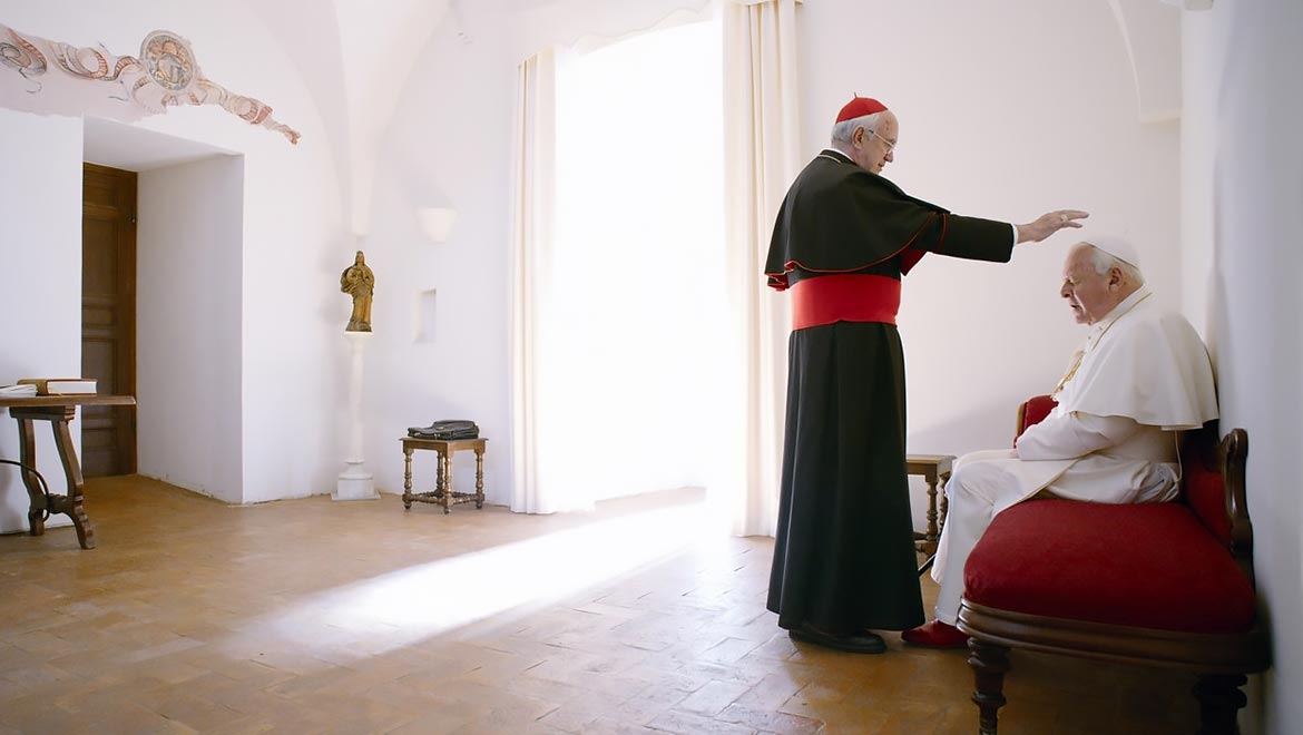
The Two Popes takes place in the lead up to the 2013 resignation of Pope Benedict, played by Anthony Hopkins, and follows an entertaining imagining of private meetings held with his successor, Cardinal Jorge Mario Bergoglio – the future Pope Francis, played by Jonathan Pryce. The film, which was released in theatres earlier in the month before streaming on Netflix beginning on December 20, has been widely praised for its humorous yet thought-provoking portrayal of an unprecedented ecclesiastical transition of power.
Directed by Fernando Meirelles with cinematography by César Charlone, the level of anticipation around the release is far from surprising. The filmmaking duo have collaborated before on critically acclaimed films The City of God (2003) and The Constant Gardener (2005) and they bring a distinctively fresh and semi-biographical feel to what has been described by critics as a pontiff bromance.
Charlone worked closely with Technicolor’s Senior Digital Supervising Colorist, Jean-Clément Soret, who developed the color palette with the support of Second DI Colorist Alex Gascoigne. Technicolor also provided front-end services for the production.
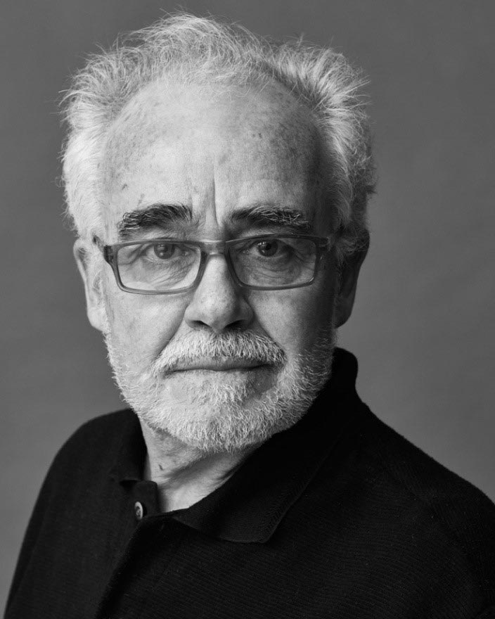
César Charlone | Photo Credit: Aleksander Salski
“Working with Technicolor on the color process for The Two Popes was a real creative adventure,” said Charlone. “I consider myself very picky when it comes to coloring a film and rely very much on this part of the filmmaking process. On this occasion, Jean-Clément was pickier than me, and took so much care in every part of the frame. I joke that instead of ‘painting with light’ as the great cinematographer Vittorio Storaro once said, I prefer ‘painting with the mouse.’ And that is where Jean-Clément is a real master. When we did the final pass with some new scenes that came in later from editorial, Alex followed with the same quality and dedication.”
The film straddles different time periods and locations, from the grandeur of Vatican City to the streets of Buenos Aires, where the future Pope Francis recounts his experience as Head of the Jesuits during Argentina’s military occupation in his youth. Charlone worked closely with Soret on the color choice and use of film grain to distinguish these shifts in time and place.
“One of the obvious choices was to use black and white for the earlier parts of Pope Francis’ life,” said Soret. “It’s one of those stereotypes where black and white means the past – especially when it’s shot with 16mm with a bit of added grain, a bit of softness and vignetting – it immediately signals to the audience that this is the past.”
Another consideration for post-production was the blending of real archive film footage with fake archive footage to ensure the narrative maintained a realistic, semi-biographical look and feel.
“We had to match real archive footage and create our own using color grading plug-ins, putting in fake TV lines, adding sharpness or softness – all sorts of tricks we have at our disposal to emulate what we think looks real and authentic,” said Soret.
“It was all shot on digital, except for the archive material which is film. A lot of the time you are asked to replicate film, so you need to know how to do it. Grain is part of the trick, but picking the right colors, giving it a film color space is the most important. As always, Baselight proved a helpful tool throughout this creative process.”
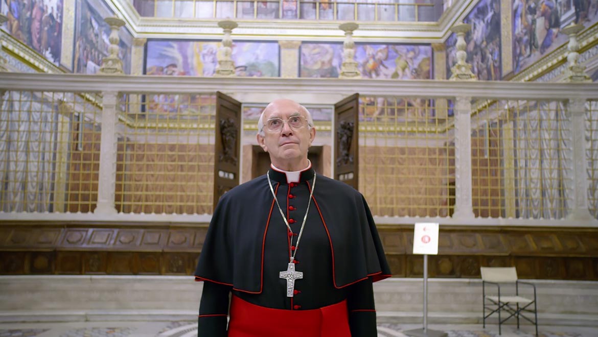
As well as addressing the shifts in time and place, the coloration of the Sistine Chapel, which was built from scratch for the set, was an impressive creative achievement for the Technicolor team, particularly when addressing Michelangelo’s iconic paintings.
“They needed to look like the real Michelangelo,” said Soret. “The color palette of the print is not the same as Michelangelo’s paintings, so we need to give the illusion that they are real, as well as dealing with things like reflection, the texture of the paper, rather than paint. This is the job of the colorist.”
Another creative and technical consideration for both Soret and Gascoigne were the red colors of the cardinals’ uniform. “Because of the way light reacts on the different fabrics, some coats were not exactly the same as the others,” said Soret. “There was a lot of keying here and there, bringing all those reds into a single hue and saturation.”
The lighting in the Vatican and the Sistine Chapel scenes is also recognizably bright and almost over exposed, which is a clear artistic choice by Charlone and Meirelles to symbolize the sense of divinity and godliness. When discussing Charlone’s style of filmmaking, Soret says that the DP uses a “language of color” – referencing an important scene where the cardinals sit together in their distinctly red uniforms having lunch whilst they await the cardinal vote for the next Pope.
“It’s a scene that is overly bright, it’s a godly place in a way,” said Soret. “Normally I would have added a vignette and tried to enhance the contrast in lots of parts of the image to make it richer, but in this instance, it was more about helping to create a particular atmosphere.”
During the HDR grade, Gascoigne was able to further enhance this sense of airiness and godliness, particularly where the light streams through the ceiling windows. “César wanted to take a subtle approach to the HDR grade,” said Gascoigne. “In many scenes, the HDR is very close to the SDR, but we found that particularly the scenes in the Sistine Chapel allowed us to push the brightness even further.”
Charlone’s style of filmmaking is very distinct, particularly the use of handheld shots as seen famously in the award-winning City of God. When discussing Charlone’s craft, both Soret and Gascoigne acknowledge that he “shoots with the grade in mind,” and they enjoyed collaborating closely with him on the project.
“César’s not afraid to try new things in the grade,” said Gascoigne. “Although he has certain things in mind during the filming process, he is very open to suggestions from the colorists during the grading process and is always keen to improve and add new flavors in the editing suite.”
“Some cinematographers really embrace color grading and it becomes a more collaborative approach where you go a lot more in depth with the manipulation of the images,” said Soret. “César is a great person to work with because he really embraces color grading and can see the potential.”
You can see The Two Popes streaming now on Netflix.

The Technicolor POSTCAST is an all-access pass to post-production. Listen to our epidsode on The Two Popes to learn about the color finishing we provided for this incredible new Netflix movie!
Listen Here