PRESS AND NEWS CENTER
October 03, 2016
Tim Burton And Technicolor Create A Magical World For Peculiar Children
Technicolor’s Senior Supervising Colorist Peter Doyle discusses color finishing on Miss Peregrine’s Home for Peculiar Children.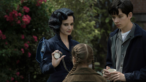
- Technicolor provided Burton’s first HDR grade for a feature film.
- Technicolor's front-end dailies and picture post-production teams provided seamless integration for the global production.
Based on Ransom Riggs’ best-selling novel, and directed by Tim Burton, Miss Peregrine’s Home for Peculiar Children follows a young boy as he uncovers a secret refuge for magical children run by Miss Peregrine (Eva Green). Technicolor London provided dailies and color finishing services for cinematographer Bruno Delbonnel’s stunning photography. Supervising Colorist Peter Doyle managed the color workflow from dailies to finishing under the watchful eyes of Tim Burton and Delbonnel.
The Technicolor dailies team followed the crew over the course of the entire shoot. The film was shot in aspect ratio 1.85 on the Arri Alexa XT, with aerial shoots using the RED Dragon. Speed, efficiency, and security were paramount and the dailies team worked with production to ensure seamless on-location delivery, processing the rushes as they were shot so that media could be provided to editorial on the same day. The Technicolor Express Dailies System ensured that the media was sent to and from set, editorial, and back to Technicolor’s London facility, where it was fully graded and sent back to editorial.
As color was particularly important to the story, Supervising Colorist Peter Doyle spoke with Technicolor.com about the creative look of the film.
Technicolor.com: What can you tell us about the inspiration for the creative look of the color grade?
Doyle: “The overall aim of the colour arch was to differentiate between the two temporal spaces that the story is split between. The creative vision for Miss Peregrine’s house was inspired by the notion of evoking a picture-postcard summer in 1940’s Britain. Rich greens, translucently vivid blue sky, and a blushing bubble-gum pink help to shape these scenes into a dream-like, warm, and happy feel. Having said this, there is a silvery dark-blue colour cue that serves to remind us that we are in a world where darkness lurks and prevents the whole look from becoming sweet or nostalgic. In contrast, the contemporary era is characterised by a blander bleakness, which echoes Asa Butterfield’s character, Jake Portman, and his sense of isolation and desolation. These two very different looks created a provocation to both be distinct enough to clearly demonstrate to the audience which era the scene is located, whilst allowing for the two eras to interact as the script demanded. Bringing characters across these temporal spaces seamlessly required a shared vision between editing, lighting and colour. Tim wanted the characters to have a real presence and for their journey to be immersive, which Bruno lit to his usual exceptional standard and this idea of ‘presence’ and ‘immersion’, I interpreted in the colour finishing to be acutely sharp, snappy and dynamic.”
Technicolor.com: How did you decide to approach the HDR grade?
Doyle: “The idea of different grades and different audience experiences of the film is a very personal choice and the kind of imagery that Tim, Bruno, and I go for means that we don’t rely on the display medium to impart the look. The medium is not the message. There is an absolute philosophical commitment to reproduce the grade across the deliverables and Bruno lights with this in mind. I built the grade in an ultra-wide colour gamut and this means that all my grades have been in floating point so there is a question of using the colour science to map the desired look onto the various display mediums. Part of that is treating the VFX in the same way and results in all our imagery translating without clipping or noise across the various brightness levels. It is an extremely technical process, but by drawing on Technicolor’s colour science and our experience, we know what to expect which allows us to direct the more technical process back into the creative. Knowing the parameters keeps the process as creative as possible.”